Wednesday, November 23, 2011

Birthday Card Series 2 - ...Awesome

This one is based on an inside joke between friends, definitely designed to piss off up the birthday recipient.

Birthday Card Series 2 - Bday/X-mas/New Years


Birthday Card Series 2 - Cult Of The Ugly

The second birthday card series I made is slightly different from the first one.  I found inspiration from a graphic designer's invitation to his nephew's birthday (his name slips my mind right now. I'll get back to it later).  Instead of just a regular card, the card folds out into an 11x17 poster. Each time you unfold the paper, a message relevant to the recipient is revealed.
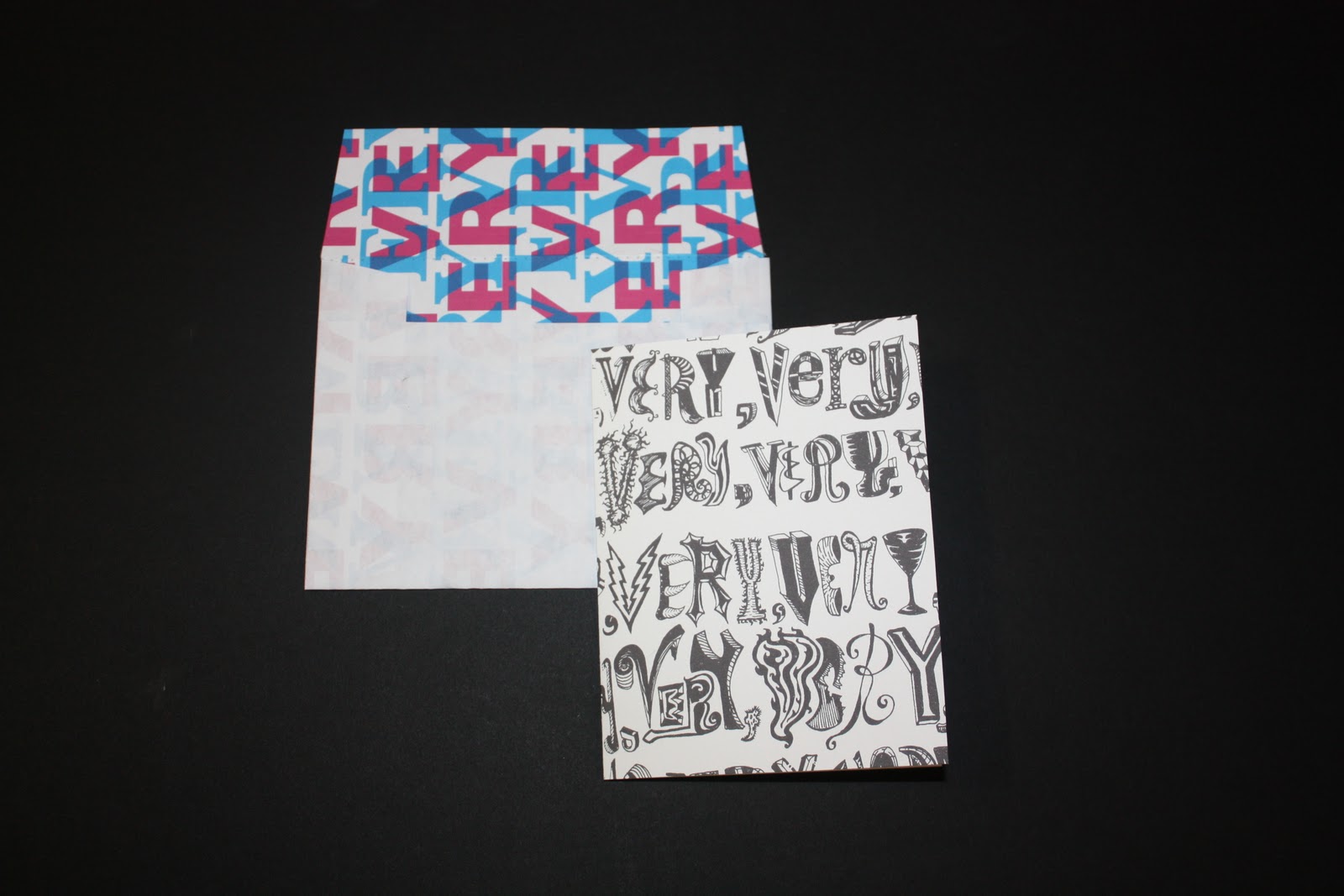
This card is based on Steven Heller's essay "The Cult of The Ugly," a harsh criticism of post modern design. One of the designers he attacked was Ed Fella, my biggest hero of hand lettering and outside the box design. The hand lettering is done (trying very hard to at least) in his loose style. The text comes straight from Heller's essay, which opens with a quote from Voltaire:
Ask a toad what is beauty… He will answer that it is a female with two great round eyes coming out of her little head, a large flat mouth, a yellow belly and a brown back.

Wednesday, November 16, 2011

Birthday Cards Series 1

A series of birthday cards, each customized for a specific person. Each person got a different handwritten type illustration as well as a corresponding custom envelope.
Carole - front
Carole - interior
Sam
Angela - front

Angela - interior
Genevieve

Wednesday, November 9, 2011

Form Magazine

Form magazine was an assignment on design history and grid systems. I chose the period of Futurism because it was a challenge to channel the movement’s chaos and dynamism into the formally gridded structure of a magazine.
Cover
Spread 1

Spread 2


Thursday, November 3, 2011

Queens College Art Dept. Website

In redesigning the Art Department website for Queens College, I wanted the starting point to be the iconic school logo, then add some quirks to the design. By adding hand letterning and jagged black and white pictures to the logo’s colors, the design retains the Queens College sensibility while appealing to potential art students.


Couples for Christ

Couples for Christ is a Catholic organization intended for the renewal and strengthening of Christian family life. I designed this poster series for a CFC meeting in Queens, New York.


Wilco - a ghost is born

A packaging redesign for Wilco’s album a ghost is born.  In order to express the band’s music and lyrics through expressive typography, I created a page for all twelve songs and layered each on a sheet of plexiglass for a layered, dynamic design.

Cover

At Least That's What You Said

Hell Is Chrome

Spiders (Kidsmoke)

Muzzle Of Bees

Hummingbird

Handshake Drugs

Wishful Thinking

Company In My Back

I'm A Wheel

Theologians

Less Than You Think

The Late Greats

CD

Back

Various Business Cards

Business cards designed for various small business in the fields of construction, interior design, and produce.